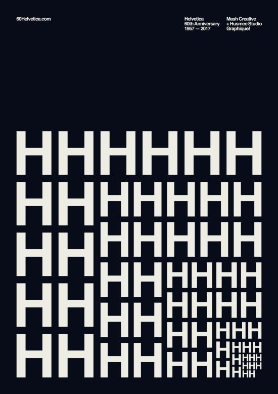
home

helvetica.

Even if you've never heard of it, Helvetica has been part of your life. This typeface is, very literally, everywhere: computer screens, billboards, buildings, street signs and posters.

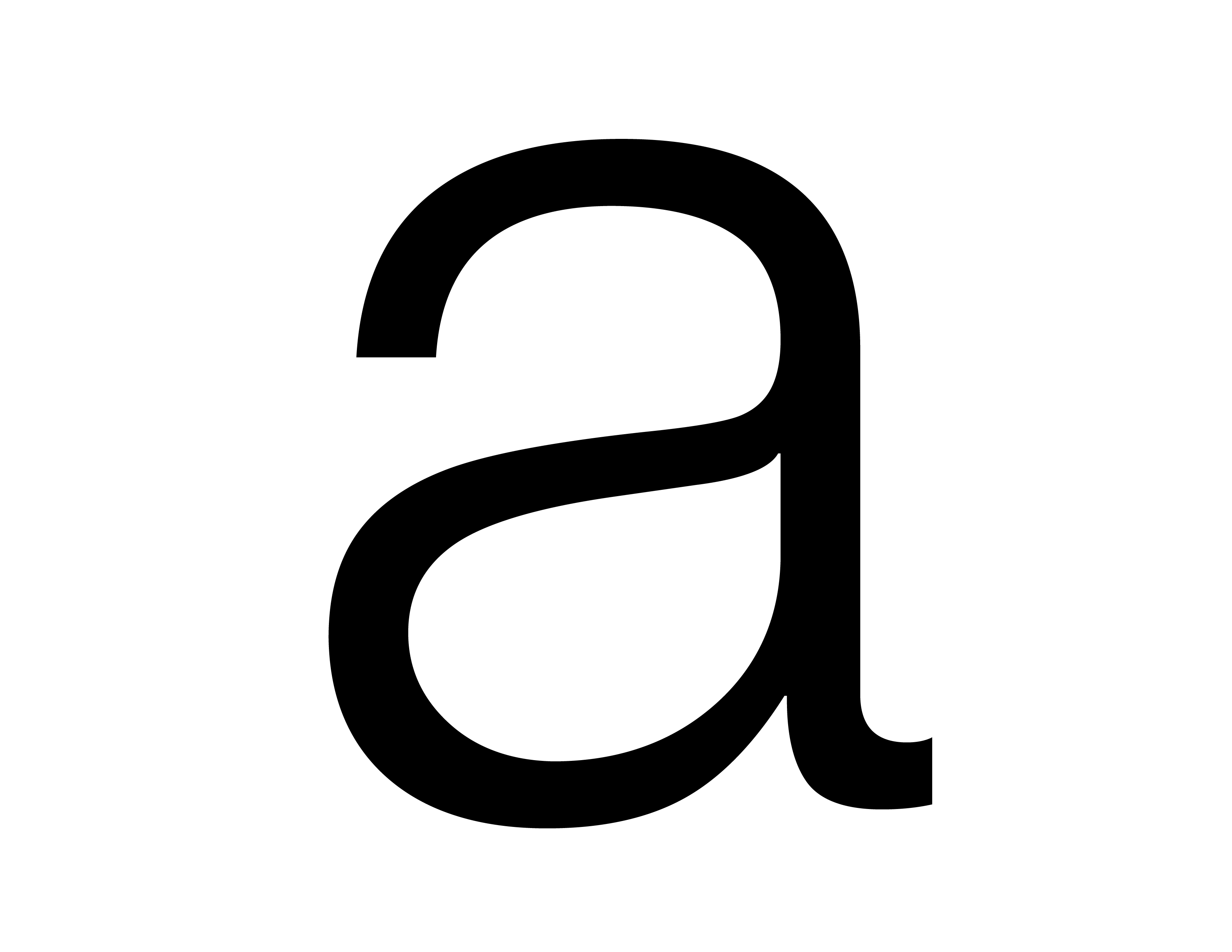
a

the right name.

It started its life as “Neue Haas Grotesk,” a boringly descriptive moniker which included the name of its maker (the Haas foundry), its design type (neo-grotesque or realist) and the fact that is was new (or “neue” in German).

The name Helvetica, which means “Swiss” in Latin as a homage to its country of origin, was adopted in 1960 to make it easier to sell it abroad.

And so it did: “Helvetica gets its first kick because the Germans come up with a great name and make it available in the two mechanisms of the day, machines and foundry type, so that anybody could buy it.”
neue haas

the right look.

Helvetica's creators, graphic designer Max Miedinger and his boss, Eduard Hoffmann, wanted a neutral and versatile design. It had to be a modern-looking “sans-serif” type, without the extending features at the end of strokes that were common in the print world.

Its lack of personality was not just intentional, but paramount. Legendary designer Massimo Vignelli, who used Helvetica for the New York Subway system, said in Gary Hustwit's eponymous 2007 documentary: “There are people that think that type should be expressive. They have a different point of view from mine.”

Its mix of features, or lack thereof, happened to be exactly what designers were looking for: “Helvetica showed up at the right place, the right time,” said in an email Ellen Lupton, curator of contemporary design at the Cooper-Hewitt, Smithsonian Design Museum in New York.

husmee 60

the right brand.

Helvetica wasn't an immediate hit in Europe, although it was available there first. But it didn't take long before it became the standard for advertising and corporate branding in the US: “In 1967 it creeps into the design for the Yankee Stadium,” said Shaw, “And by 1968 it's everywhere in America - it is the typeface.”

Vignelli chooses it for the American Airlines logo, which will remain untouched until 2013 - one of the most enduring corporate identities of the 20th Century. It ends up - sometimes with minor variations - in countless company logos including those of BMW, Crate&Barrel, Fendi, Jeep, Kawasaki, Knoll, Lufthansa, Mattel, Nestlé, Panasonic, Scotch, Skype, Target, Texaco, Tupperware, and Verizon. NASA paints it on the side of the Space Shuttle. The US government redesigned its tax forms with it.

the right species.

The popularity of Helvetica continues today. It was the system font on the original iPhone, and it remained part of iOS until 2015, when Apple replaced it with its own San Francisco.

It continues to inspire: the font used in this article and the rest of CNN's website is a close relative of Helvetica called CNN Sans. Microsoft's knockoff of Helvetica, called Arial, is one of Windows' most popular system fonts.

“The fact that people didn't feel passionate about it in retrospect is interesting,” said Shaw, “It's not a terrible typeface, it's just heavily overrated.”